Follow us on Facebook and Twitter

Working with a prospective client recently, a recurring idea in building design came up – the notion of wasting space.
It’s a term designers and clients frequently use, but also one we don’t always consider carefully. Today, I want to provide a framework for thinking about wasted space in design efforts of all kinds, and to highlight two important and common ways of wasting space in building design. In their essence, these two ways are creating space that is either too full or too empty. And by avoiding each extreme, we can reliably avoid wasting both space and time.
In the client discussion I mentioned, we were considering two design ideas for a project. The designs each had the same enclosed floor area and basic plan, but differed somewhat in the amount of garden space and walkways around the living areas. Overall, the first design was slightly more compact in its total dimensions and the second had a somewhat larger total footprint, owing to the expanded garden and walkway areas. But all other things were equal, and the two designs had identical interior proportions. So, is it correct to say that the larger plan had more wasted space?

Enormous, Luxuriant Space – How Much Of It Is Wasted?
The first design clearly used less space and in this sense was more efficient or compact. Similarly, the second design can be seen as using space less efficiently, or as containing more unused or unfilled space. But the second design was also more compelling and livable, and felt much larger and more open than its modestly greater dimensions might have suggested. One might argue, then, that the second design was a better use of space – especially if both designs were affordable or within budget, which they were in this case.
These considerations point to two fundamental, sometimes competing, but not mutually exclusive goals in spatial design – the task of achieving adequate efficiency or compactness and then sufficient elegance or extension. Both goals are integral to excellence in natural design, and arise again and again in a variety of creative and artistic domains (for example, even in the non-visual arts of music and writing). In total, ensuring both efficiency and elegance is a challenge we all must often repeatedly address and resolve, if we are to design and create successfully.
As my sunset photo above suggests, in an important sense space is never wholly wasted if it is elegant. And the 150 million kilometers of extension that lie between us and the sun are hardly wasted space, even in strict utilitarian terms, since the earth would warm and life would be curtailed if this distance were much less. More artistically, our solar system and larger universe likely would be far less elegant – or less mysterious and intriguing – if either were tightly compact and plainer to the eye.
Still, efficiency considerations are a natural concern in design, art, and fabrication, since all uses of space and other resources have costs and alternatives, and never only provide benefits. At the same time, there is a certain marvel with or satisfaction in the efficient or dense use of space, though this is rarely enough to be a substitute for true elegance in design (again, with useful analogies in music, writing, and other artistic domains).
But just as the single-minded pursuit of elegance can overlook or miss efficiency considerations, a preoccupation with design efficiency can unduly, and often needlessly, impinge on essential design elegance. In practice, both inadequate efficiency and insufficient elegance are reliable ways to reduce natural excellence in design and to waste space. And both shortcomings are likely to occur whenever designers, builders, or clients act inattentively, or without an essential understanding of these twin natural needs when creating.
To demonstrate these ideas, and to make them more tangible and applicable, below are three brief case studies. Each explores and underscores the importance of meeting the essential natural design goals of efficiency and elegance. And each suggests that this process involves striking a balance – or what I have elsewhere called a natural centering, or the avoidance of limiting extremes – in this case between excessive compactness and openness, clutter and emptiness, or expedience and extravagance. In these and many other cases, excesses in either direction can be understood as generally wasting space, and reliably produce designs below our potential.
Case Study #1: Intimate Space
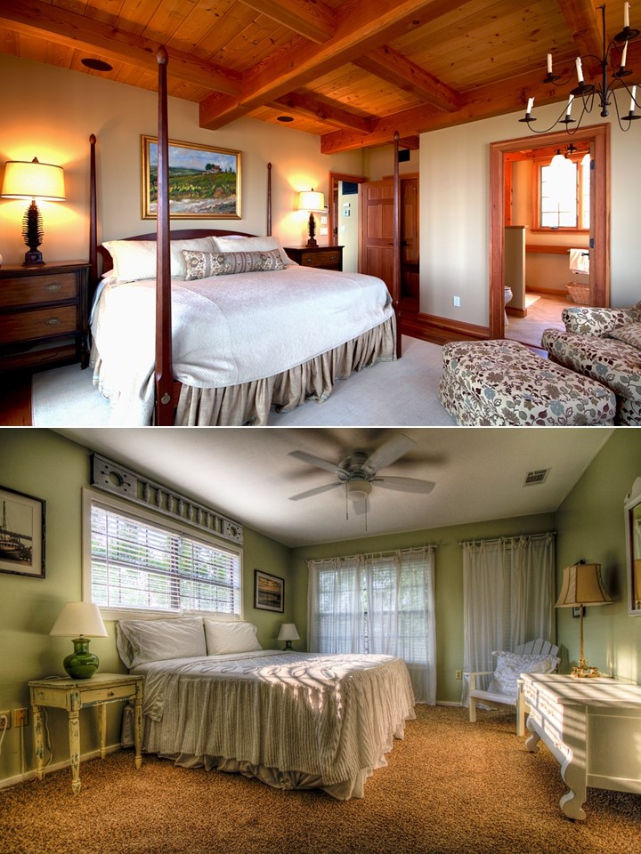
My first case study compares two modest bedrooms that are similarly sized and contain almost identical types of furniture. But as you probably can sense right away, and leaving aside your stylistic preferences, the top bedroom feels relatively full, over-furnished, and confining, while the bottom bedroom seems more open, expansive, and therefore elegant – and it notably achieves these outcomes with less expensive furniture pieces.
Crucial to this difference is the greater amount of open space in the second design, both physically or practically and in the attentive ways the feeling of space has been increased perceptually. These latter steps include the use of consistent flooring, horizontal furniture and decoration, and reduced contrast in the fabrics and accent colors.
Case Study #2: Semi-Public Space
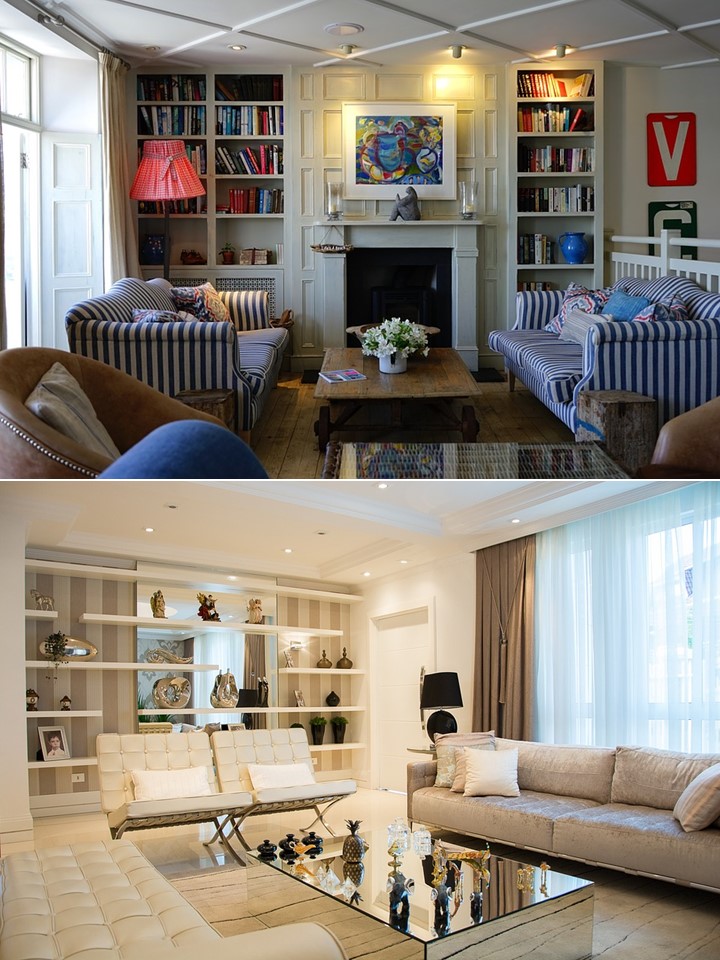
The second case study looks at two living rooms with similar differences and issues as in the first example. Again, leaving aside our personal tastes in design and decoration, the top living room feels and can be factually understood as excessively compacted, filled, and restricted. It has comparatively more limited opportunities for movement and a greater number of divergent surfaces and textures – ones that ultimately obscure or waste, rather than liberate, the room’s waiting natural space and elegance.
By contrast, the lower living room is physically more open and therefore naturally feels more graceful and sophisticated. As with the two bedrooms, the formula for this superior result is similar – sufficient open or unfilled space, and more consistent and muted materials and colors. On this point, I would again highlight that the two rooms are quite similar in many regards, with comparable dimensions, types of furniture, amounts of natural and electrical lighting, and even uses of stripes (which you may not have initially noticed in the lower room).
Case Study #3: Outdoor Space
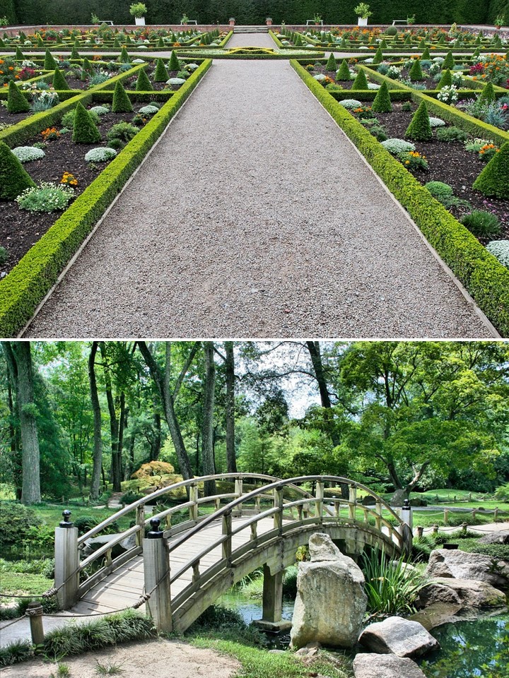
My third case study involves an opposite example, where the top space feels too open, underutilized, and extravagant – or too preoccupied with elegance and dismissive of efficiency concerns – while the bottom space achieves a better use of space, or a natural balancing or combination of efficiency and elegance. And as with the first example, it does this while using fewer resources.
Though this example involves comparing two garden spaces, the principles are the same as indoors, and in many other design areas too. In this example, the lower garden is comparatively modest in size and materials, but opens the space through easy circulation, a mix of filled and unfilled areas, and the use of soft or receding colors and textures.
The top garden, by contrast, feels at once empty and overwrought, with no places that offer special moments or opportunities for heightened attention, or simply places to physically stop and rest – what is sometimes called prospect and refuge. Overall, the garden is unduly or excessively extravagant and resource-intensive, and it is thus naturally unsatisfying. It inadequately articulates and liberates the volume it occupies. And, to my eye, it offers a clear example of wasting of space through overlooked, rather than dogged, efficiency or compactness considerations.
I hope this discussion and my examples prove useful to you, and help you to improve the quality of the designs you create or support. To these ends, I would encourage you to explore and deepen your understanding of our natural need and opportunity to make our surroundings and implements both efficient and elegant – by looking for these two qualities in designed spaces and other created products around you.
And as suggested, I would also encourage you to reflect on the idea that rich or enduring natural expressions of either of these qualities is often impossible without the other. In true elegance, there is usually underlying efficiency or economy, and in natural efficiency, inherent elegance and marvel. Let me know what you think in the comments section below.
Mark Lundegren is the founder of ArchaNatura.
Tell others about ArchaNatura…encourage modern natural design!
